
Find these graphics in Library → Motion → Elements. Each group below is its own section there: Headers, Notes, Cards, Chat, Chips, Arrows and Strokes. Every tile is a ready-made look of one graphic. Click a tile to add it at the playhead, or drag it onto the timeline. Change its text and colours in the Inspector; colour options can link to your Brand kit.

Headers

Section header

Section header graphic poster
An explainer section header: an orange block arrow and a cream pill with an optional pink number and bold text on one line. Tiles: Numbered and Plain. Key options:
  • Text: the header text, on one line.
  • Number: the section number before the text. Leave it empty to hide it.
  • Arrow: shows or hides the block arrow before the pill.
When to use: marking the start of each part of a lesson or a list video.

Notes

Sticky note

Sticky note graphic poster
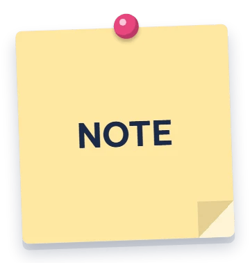
A tilted square sticky note with a pin or tape, an optional number disc, a folded corner and centred bold text. Tiles: Yellow note, Pink note, Blue note and Green note. Key options:
  • Text: the note text. Line breaks are kept; long lines wrap.
  • Number: a number in a dark disc at the top left. Leave it empty to hide it.
  • Pin: what holds the note, a round pin, a strip of tape or nothing.
When to use: tips, reminders and numbered key points.

Cards

Window card

Window card graphic poster
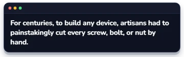
A dark or light app window card with an optional title bar, a small-caps label, a struck-through wrong version, body text, a muted note and chip rows. Tiles: Card, Correction and Better way. Key options:
  • Label: a small-caps heading above the text, for example GRAMMAR.
  • Strike: a wrong version shown struck through in red above the text, with a warning icon.
  • Chips: chip rows under the text, one chip per line (same format as Chips below).
When to use: language lessons and before/after corrections, or any short text that needs a frame.

Chat

Chat bubble

Chat bubble graphic poster
A chat message bubble with the speaker’s disc on the right or left, optionally inside a dark chat window with a contact header. Tiles: My message and Their message. Key options:
  • Side: Right for the speaker, Left for the other person.
  • Avatar: an image for the speaker’s disc. Without one, the disc shows Avatar text.
  • Card: draws the dark chat window behind the conversation.
When to use: dialogues, role-play scenes and message screenshots you rebuild in the video.

Chips

Chips

Chips graphic poster
A wrapping row of word chips, each marked ok ✓, warn ⚠, bad ✗ or neutral. A leading * highlights a chip with a pink ring. Tiles: Ok / warn mix and Highlighted. Key options:
  • Text: one chip per line. Start a line with * to highlight it, then ✓, ⚠ or ✗ (no mark = neutral).
  • Icon side: the status icon after (End) or before (Start) the word.
  • Theme: Dark or Light colours for neutral chips.
When to use: word-by-word feedback, keyword lists and tags.

Arrows

Callout arrow

Callout arrow graphic poster
A pointing arrow, curved or straight like a marker stroke, or a filled block arrow, with an optional bold label. Tiles: Curved arrow and Block arrow. Key options:
  • Style: Curved, Straight or Block.
  • Bend: for the curved style, how much the arrow bows (0 = straight). The arrow points right; rotate the item to aim it.
  • Label: bold text beside the arrow, on one line.
When to use: pointing at a detail on screen. To draw the arrow on, set In to Draw on in the Inspector.

Strokes

Hand-drawn stroke

Hand-drawn stroke graphic poster
A hand-drawn mark in a marker doodle style: x, tick, underline, circle or arrow. Tiles: Tick, Underline, X scribble, Circle and Arrow. Key options:
  • Shape: the mark to draw. X and Arrow draw several strokes one after another.
  • Roughness: hand wobble (0 = clean, 1 = most wobble).
  • Highlight: a thin white sheen inside the first stroke.
When to use: ticking, circling or crossing out words and parts of the screen. To draw it on stroke by stroke, set In to Draw on in the Inspector.

More

The More section collects graphics that have no group. It appears only when such a graphic exists. In the current version every graphic belongs to one of the groups above, so you do not see this section.